5 Website Design Strategies That Actually Convert Dream Clients
April 22, 2026
You’ve done the work to get found on Google. You’re showing up in search results, your blog is bringing in traffic, and dream clients are clicking through to your site.
And then… they leave. Not because your work isn’t good enough, and not because your pricing is too high. But because your website isn’t closing the deal.
Here’s the truth: SEO and website design are two halves of the same system. SEO gets dream clients to your door. Your website has to make them walk through it. And it has exactly 3 seconds to do that.
Not 30 seconds, or after they read your service page. Three seconds.
It’s the immediate feeling they get when they land on your site. A “she gets me” or an instant “back to the search bar” moment. And more often than not, they’re not even fully aware they’re making this snap decision.
So the question is: is your website creating a full body yes the moment an aligned client lands on it?
Let’s walk through exactly how to make that happen. The first three strategies on this list are what convert aligned clients in those critical first three seconds. Get these right and you’re already ahead of 90% of your competitors. The final two are what keep them thinking “she’s the one” as they explore deeper into your site.
Because when both pieces are working together, dream clients inquire, basically already sold. Sales calls stop feeling like hard pitches. And you start booking aligned clients who don’t flinch at your prices.

I’m Kara, founder of Palme Design Co. Since 2019 I’ve helped 200+ wedding photographers and creatives build strategic Showit websites and brands that book more aligned clients, raise their prices confidently, and show up online in a way that finally matches the quality of their work.
I’ve seen firsthand what separates a website that books and one that bounces. And it almost always comes down to these five things. Let’s dive in!
1. Carefully Selected Hero Imagery
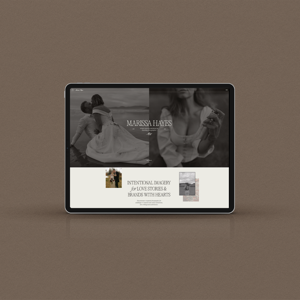
Your hero banner is the first thing a potential client sees when they land on your website. And it needs to do one thing immediately: reflect the caliber of work you do and the type of work you want to book more of.
This sounds obvious… but you would be surprised how many websites have hero images that are completely misaligned with their dream client.
Let’s say for example, you are a wedding photographer and you are leading with senior portraits or brand photography in your hero banner… yikes! You’re giving the impression that you are not the expert in the area of wedding photography which cheapens your service’s perceived value in their mind.
Your imagery is sending a signal before a single word is read. Make sure it is sending the right one. Ask yourself: if my dream client landed on my website right now, would they immediately see themselves in these images? Would they feel like my service was made for them?
If the answer is anything other than a clear yes, it is time to update your hero imagery.
2. A Clear Positioning Statement in Your Hero Banner
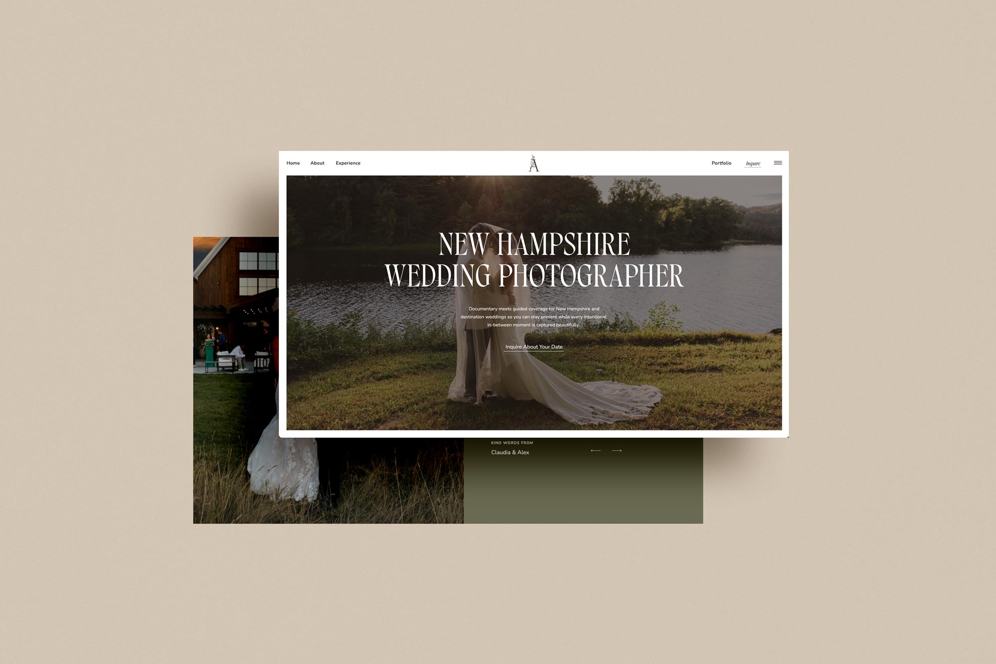
This is the one I see people get wrong more than anything else. If you just have your logo or business name… or no text at all, just some pretty photos, you are missing out on essential real estate on your website to convert your dream clients.
Your hero banner needs to communicate three things immediately and clearly: who you are, who you serve, and the problem you solve. This is your “I do X for X so they can X” statement. Your positioning in one clean, confident sentence.
For example if you’re a California wedding photographer, you could put “Photographing your Temecula California Wedding timelessly so that you can cherish your wedding day for generations.”
When this is done well something really powerful happens. Aligned clients immediately feel seen and like you’d be the perfect fit. And clients who are not the right fit will quietly self filter out before they even reach your contact form. That means fewer ghosted inquiries, fewer price objections, and a whole lot more of the clients you actually want to work with. Major wins all around!
Your positioning statement is not your name and your job title. “Jane Smith, Wedding Photographer” is not a positioning statement. It tells someone nothing about why you are the right choice for them specifically.
Get specific, get clear, and put it in the hero where they couldn’t miss it if they tried.
3. A Clean Navigation Bar
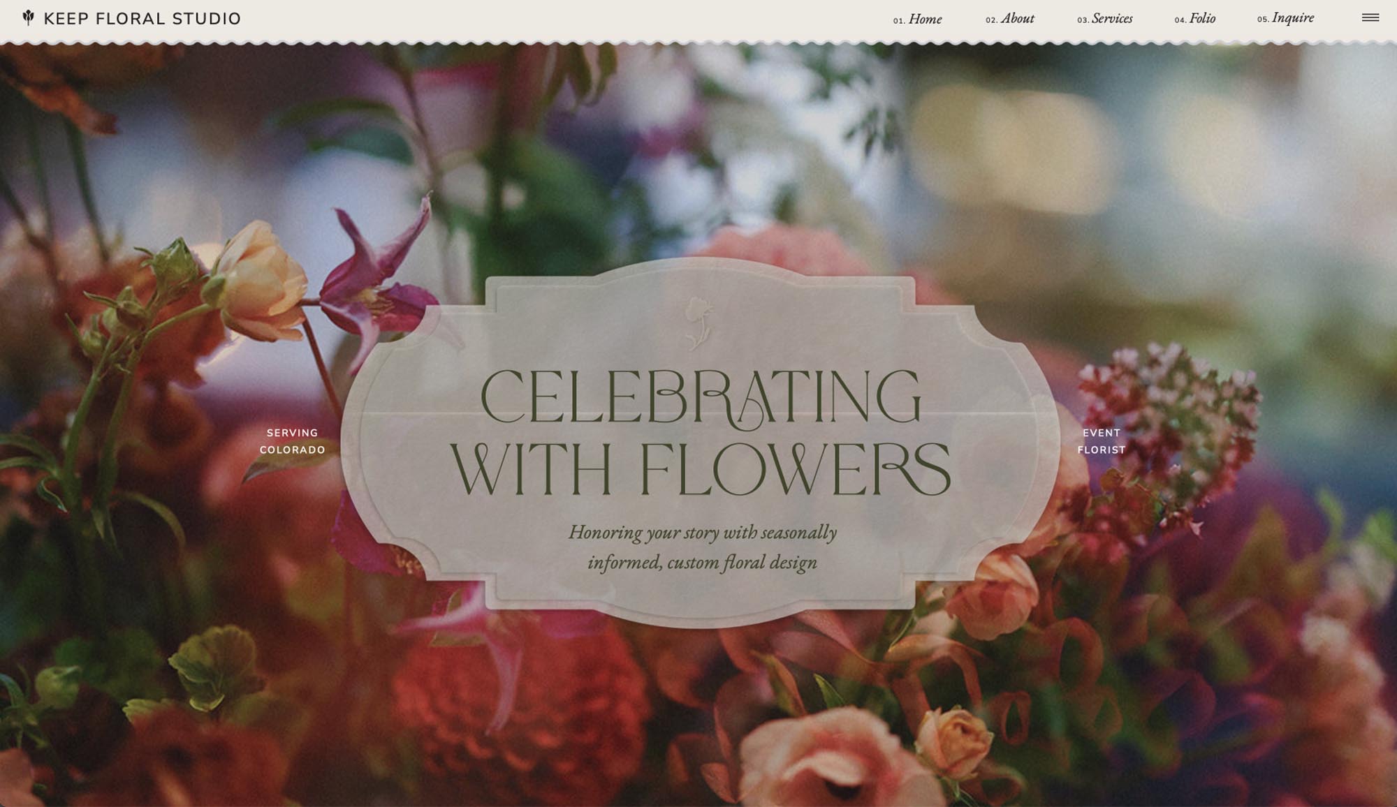
Think of your navigation bar as the featured menu for your entire website. It should guide visitors to the most important pages quickly and without confusion. No cutesy names allowed here! Only straightforward link names so someone knows exactly where they’re headed when they click on a page (i.e. for your service page, instead of “The Vibes” or “Work With Me” just put “Services” or the name of what you do like “Weddings”)
Ideally you want no more than five links in your main navigation. The most relevant and important pages only. Lesser pages can live internally within your main pages or down in your footer. You can also use a secondary menu bar, and use a smaller font for additional links under your main links without cluttering the main navigation.
And here is a bonus tip that makes a bigger difference than you might think: highlight your contact link in the navigation bar. Make it a button. Give it a different color. Do something to make it stand out from the other links so a dream client who is ready to reach out can find it immediately without having to hunt.
The fewer decisions someone has to make on your website the better. A clean navigation removes friction and guides your dream client exactly where you want them to go.

4. Use Your Testimonials Strategically
Here is a mistake I see constantly: testimonials on a dedicated reviews page that most visitors never actually navigate to. Meanwhile their homepage, services page, and contact page have zero social proof anywhere near the sections that matter most.
Testimonials should live throughout your website, not in one place. Aim for one or two on your homepage, one to three on your services page, and at least one near your inquiry form on your contact page. You want social proof showing up right when a potential client is on the edge of a decision.
And here is the thing about the testimonials themselves: less is more. One or two punchy sentences that get right to the point will get read. An entire paragraph will get skipped. Edit your testimonials ruthlessly and pull out the most powerful lines.
Mix up your testimonial formats too. Written quotes, video testimonials, and screenshots of messages or DMs all resonate differently. Someone who is visually driven will connect with a screenshot. Someone who needs to hear the emotion will connect with video. Using a variety means you can resonate with more of the people landing on your site.
BONUS: If you want better testimonials to work with, ask better questions. Here are five that consistently generate powerful responses:
What would you say to someone who is on the fence about investing in this?
What is your life or business like now after working together?
What has been the most valuable part of our work together?
What were you unsure about before we started?
Any other thoughts you would like to share?
Drop these into a Google Form and send it to clients you loved working with. Always include your Google Business review link so they can leave a public review at the same time.

5. A Clear Contact Page and Inquiry Experience
Your contact page is where a warm lead becomes an actual inquiry. Do not make them work for it.
Keep your inquiry form simple. Name, email, date, and one open ended question. That is it. Every additional field you add is another opportunity for someone to get overwhelmed and click away. Long forms kill conversions. I come across these time and time again.
But here is the part most website owners completely overlook: what happens after they hit submit.
Your thank you page is prime real estate. Use it. Send them somewhere that immediately sets the tone for your client experience, gets them excited about working with you, and keeps you top of mind while they wait to hear back. Link them to a helpful resource. Show them a behind the scenes video. Share a client love story. If part of your process is to book a sales call, enticing them here with a booking form and a video of you inviting them to schedule a call. Do something that makes them think “I already love her and we haven’t even talked yet.”
That feeling is what turns an inquiry into a booking.

Want a Website That Does All of This And More?
Everything I just walked you through is exactly what I build inside Booked & Branded. My signature 3 day brand and website intensive designed specifically for creatives who are ready to attract aligned, higher paying clients and stop leaving money on the table with a website that is flops when it comes to selling your services.
In just 3 days I’ll build you a strategic, elevated Showit website and brand that converts dream clients before you ever get on a call. No more second guessing your pricing. No more misaligned inquiries. Just a website that does the selling for you.
If that sounds like exactly what you need, I would love for you to check it out.
And if you want more no-fluff website and branding tips for wedding photographers, come find me on Instagram at @palmedesignco where I share this kind of content every week. I would love to connect with you over there.
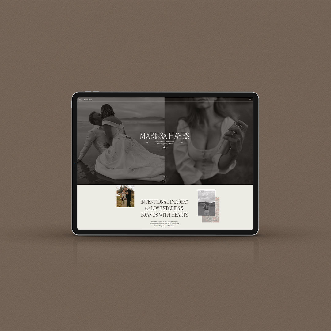


I know how it feels to be stretched thin, trying to juggle all the things – marketing, sales, content creation, all while trying to serve your clients well. I’m here to simplify your life and handle all things SEO!
With years of experience helping service providers and creatives get found online, plus four websites of my own—including my photography business that generates all its leads from Google—I know how to turn your website into a client magnet. I’m the SEO expert you can trust to make your business visible.
Meet Taylor, your new SEO bestie
about your certified seo specialist


